
 Norsk
Website for florists
A few sentences about the shop are enough. The AI writes your range, the wedding and funeral pages and the delivery information, and puts the opening hours where people look for them.
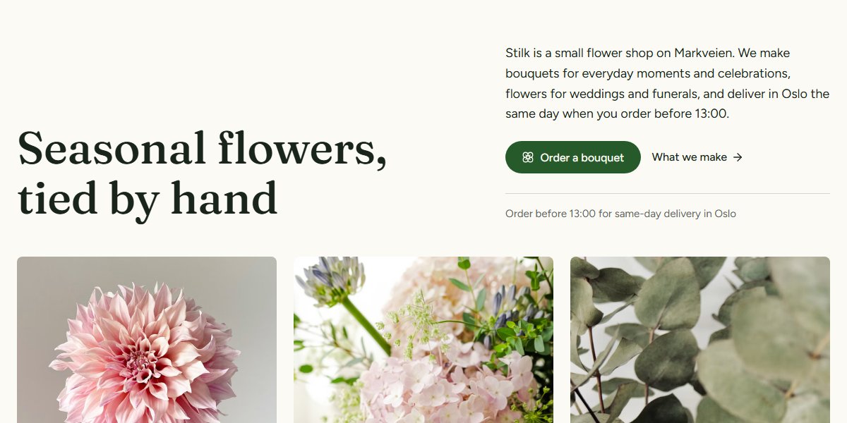
Themes built for florists
See how the services, photos and contact with customers are laid out. Open the preview to try the other pages. You can adapt the colours, fonts and content to your business.
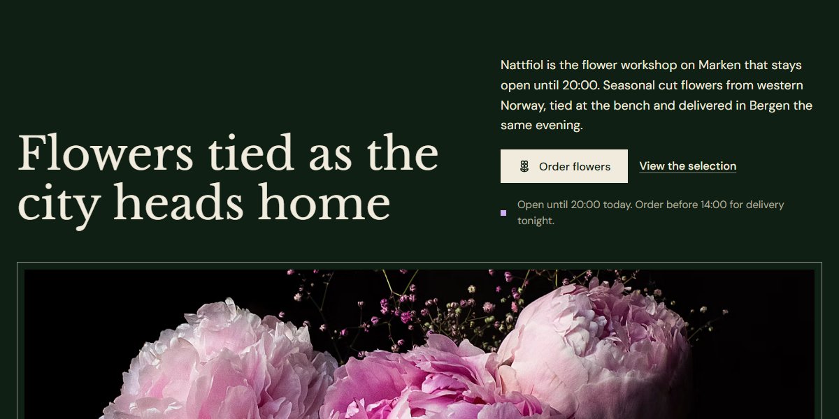
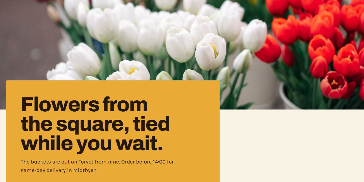
The pages florists need
The AI plans the pages from your description. Here is a suggestion for florists, which you can adapt to your services and customers.
- Our flowers
- Weddings
- Funerals
- Subscriptions and businesses
- Delivery
- About the shop
- Contact
The suggestion has 7 pages. Add and remove pages as you like.
What makes the difference for florists
The advice below is for this industry, not websites in general. It applies just as much whether you build the site here or somewhere else entirely.
Weddings and funerals shouldn't share a page
Those two customers are in completely different places. One is planning a year ahead, the other is calling today because someone has died. Each page needs its own tone, its own photos and its own way of ordering.
Your opening hours are what people visit most
Put them at the bottom of every page, not only the contact page, and spell out public holidays. They're also the first thing Google shows when someone searches for your name.
Say what delivery costs and how far you drive
Districts or post codes, and the last order time for same-day delivery. That one detail decides more purchases than your whole range page does.
Questions florists ask
The answers are the ones we would give on the phone.
Does the shop need an online shop?
Rarely. Most orders come by phone or through a form, and a good photo gallery with price ranges takes you a long way. An online shop is a project of its own, with stock and shipping.
How often does the range need updating?
The seasons do the work. Change the photos four times a year, for spring, summer, autumn and Christmas, and leave it at that. A page with tulips in October is worse than a page with fewer photos.
Which of the three themes suits our shop?
They are designed differently on purpose: one light and clean, one dark and atmospheric, one warm and down to earth. Choose the one most like the inside of your shop. It's the same customer who walks through the door.
Other industries
Neighbouring industries have pages of their own, with their own themes and their own advice.
Website for bakeries and cafés
Show what's in the counter, when the café is open and how customers order for a party. The AI makes the pages from your description, with room for the menu, your own food photos and requests for cakes and larger orders.
See the industry pageWebsite for caterers
Tell us what your kitchen delivers, and the AI writes the menu pages, the event pages and the request form. The form asks for the date, the number of guests and allergies: the three things you need to know anyway.
See the industry pageWebsite for beauty salons
Help customers choose a treatment before they book. Describe what the salon offers, and the AI makes a draft with a treatment menu, prices, durations and a clear path to booking.
See the industry page
Your website is one description away
Write a few sentences about your business, and you have somewhere to start.